Overview
The Edible Book Festival challenges designers to work outside of their comfort zones. As the project begins, food and other edible items are used as the starting point. Each student recreates a book jacket of their choosing, using whatever unconventional materials they can find to symbolize the book’s concepts and themes. The student works will be displayed in the RWU library on April 10th.
My Book
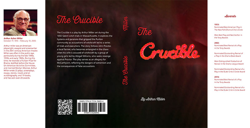
For my project, I chose The Crucible, by Arthur Miller. If you are unfamiliar with this play, it was written in the 1950s to dramatize the Salem witch trials. If you know anything about the U.S. during the 1950s, you’ll know that communism, or the hatred thereof, was a very hot topic. Miller wrote this play to symbolize McCarthyism and the sheer level of hysteria surrounding communism. Everyone you knew could have been a communist spy; at the point of a finger, your next-door neighbor would no longer be invited to summer barbeques.
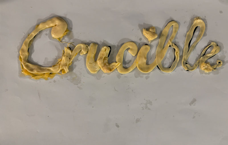
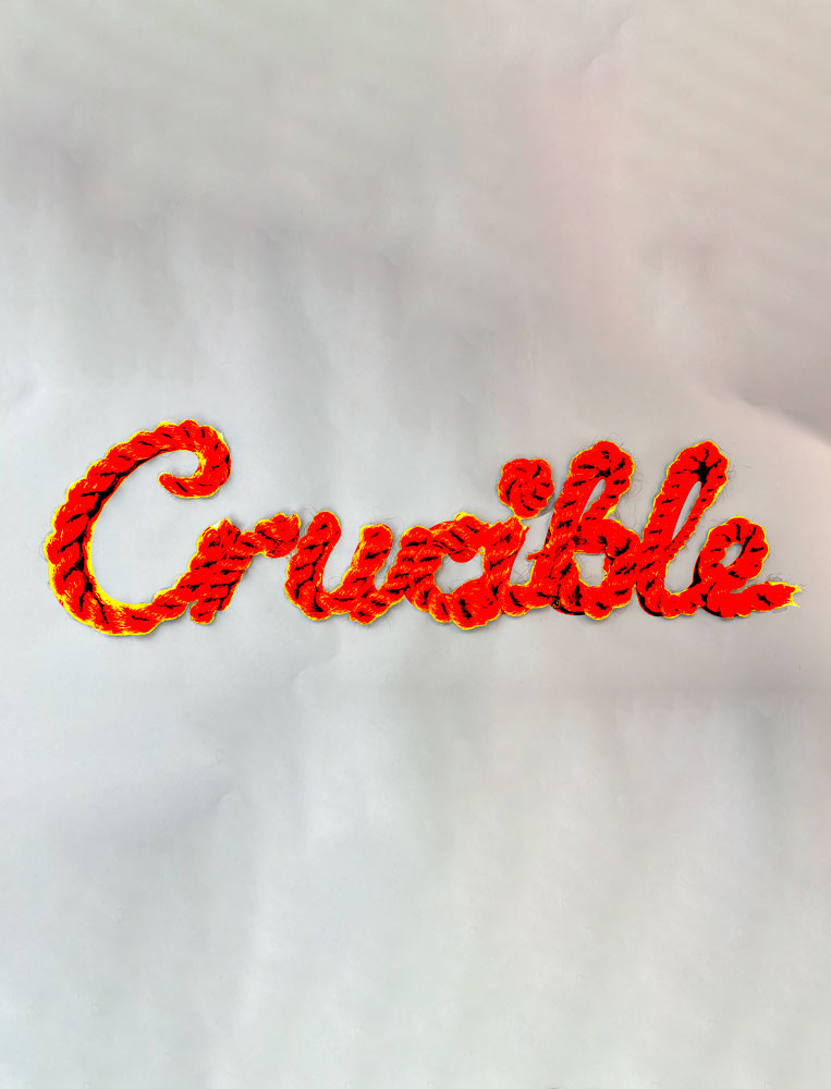
I’m not exactly sure why I chose The Crucible, but it popped into my head as soon as I was assigned this project. I knew that I wanted some kind of cursive font for this book because I wanted to use melted cheese as my food. Again, no clue why or how this idea came to me, but I decided to run with it.
Phase 1
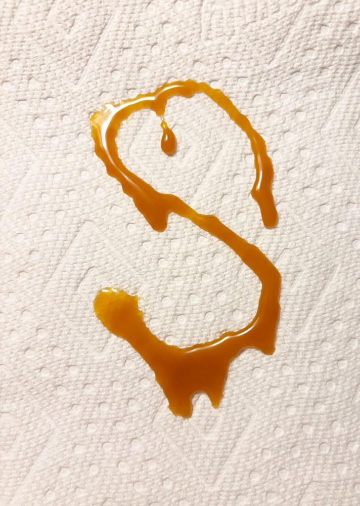
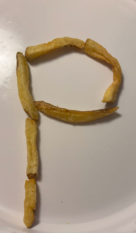
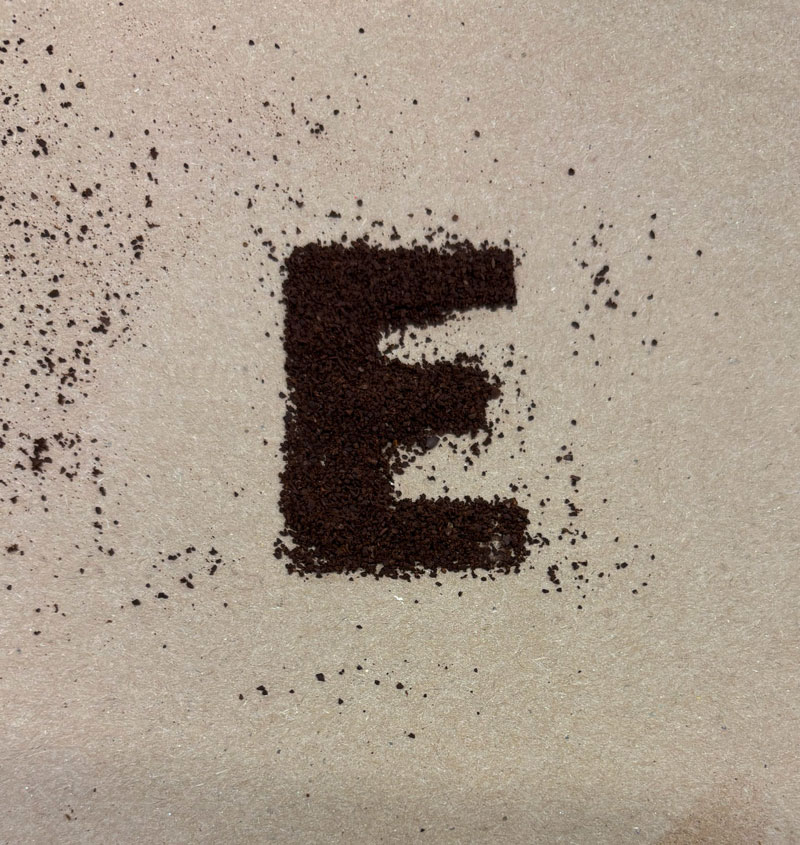
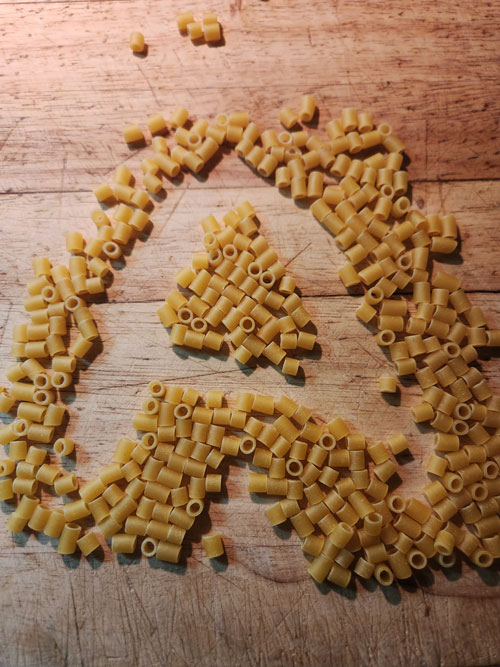
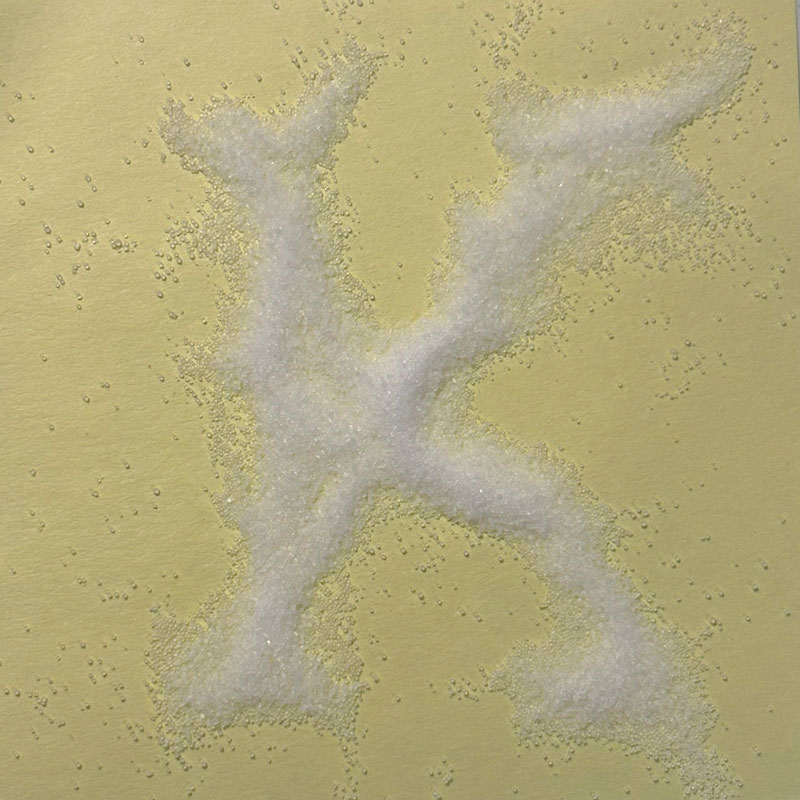
The first phase of the project was to find foods that we could use for just one letter of a random verb (my verb was “speak”).
Phase 2
The next task was to start doing groups of letters, or the full word.
I think I kind of skipped this step and went straight to phase 3.
Phase 3
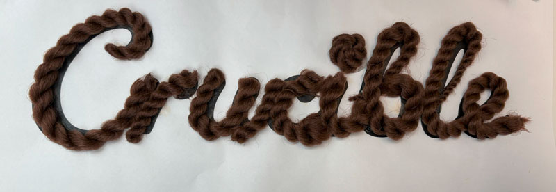
The third phase was to take your favorite method and use it for a word in the chosen book title.
Phase 4
The second to last phase was to put our creations into Photoshop and clean them up. I struggled a lot with this phase because I had never used Photoshop before this class.
Phase 5
The last part of this project was to create a book cover in InDesign, complete with informational side flaps and a QR code that leads to this website! This part took the longest, and it was the most complicated. Fun fact: I had to print the cover FIVE TIMES to get it how I wanted it to be. So much for third time’s the charm, right? I’m so happy with how it turned out, and I think it’s better than the cover that came on this book (it was plain white and boring).