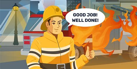
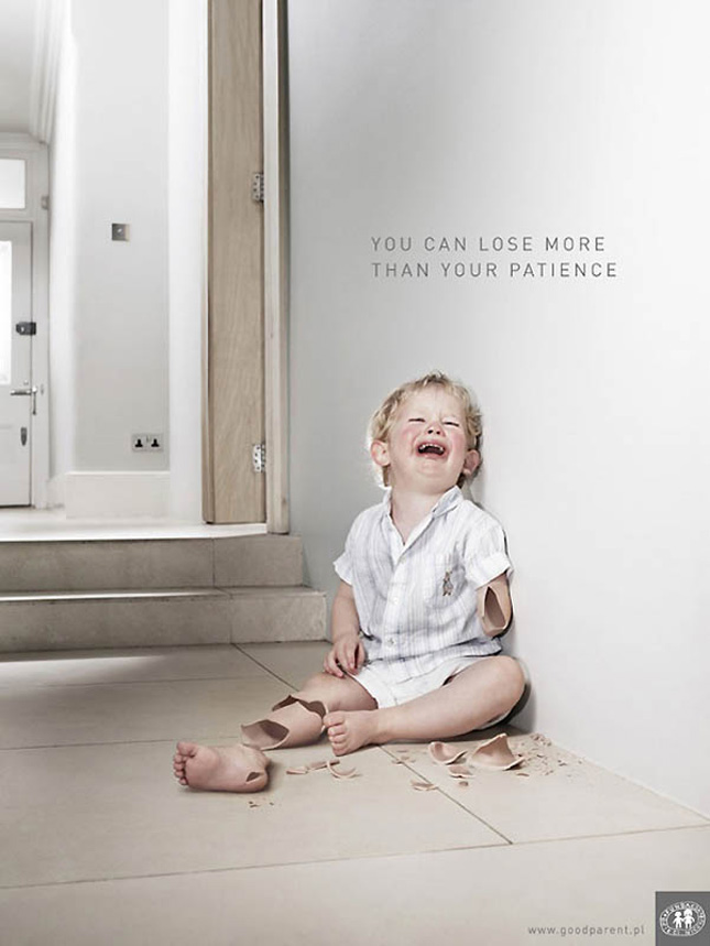
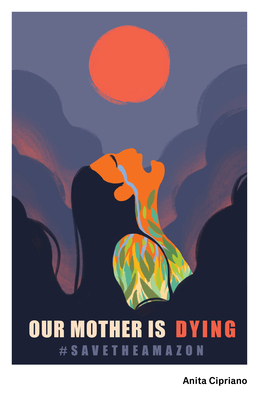
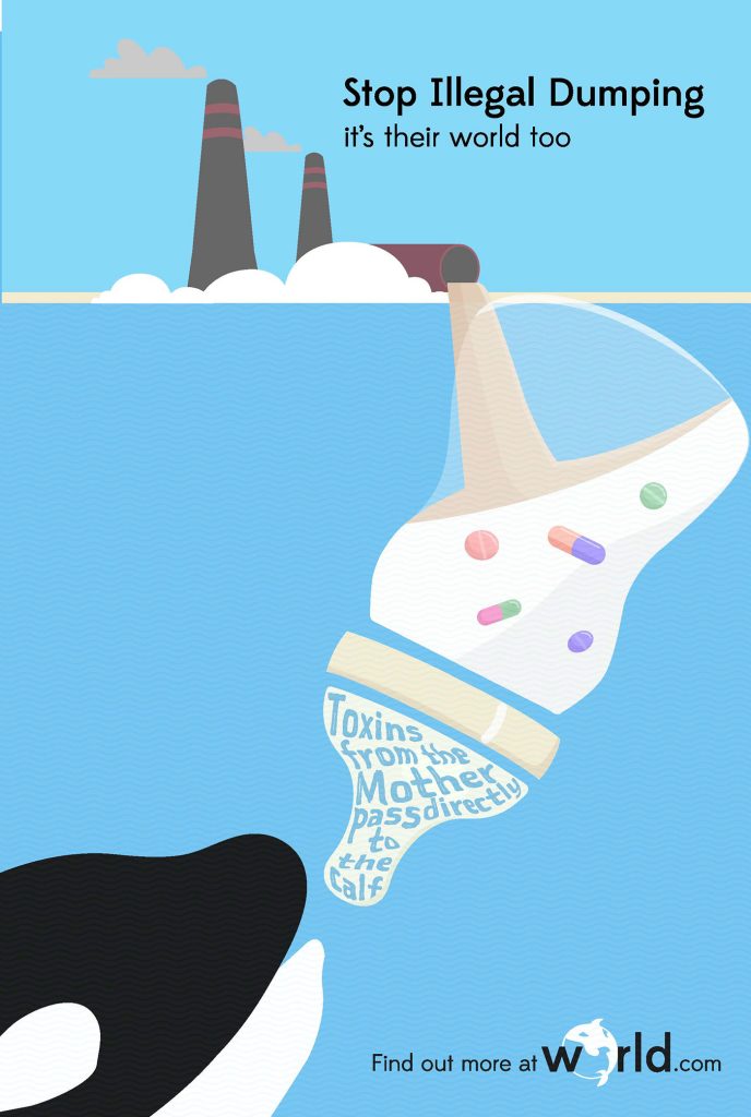
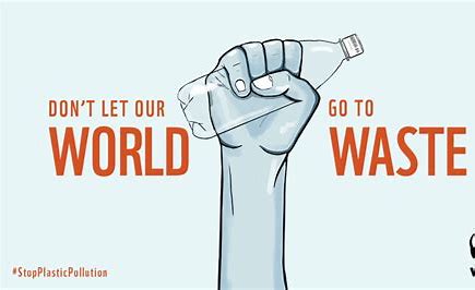
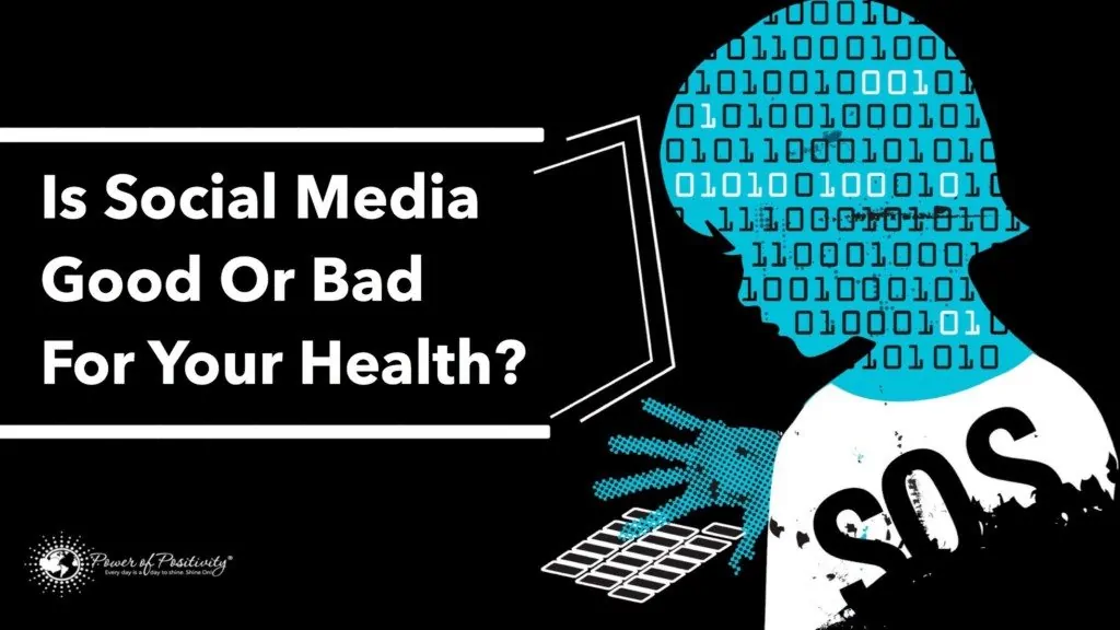
This project implements different communication methods and persuasive imagery to raise awareness of a topic. Designers use seven major communication methods: metaphor, irony, shock, emotion, fact, instruction, and coding. Here’s an example of each one.
Metaphor

Irony
Shock
Emotion
Fact
Instruction
Coding
My environmental topic is saving the national parks of the U.S. When someone asks me about my bucket list, I always say that I want to see all the national parks. The National Park Association Conservation (NPAC) relies solely on donations from the public and is extremely underfunded. American national parks are in danger of losing their leases. The target audience for this topic is the general public, especially people who take nature for granted. I intend to use instruction, emotion, shock, or irony for my project. I plan on using the Redwood National and State Parks and Teddy Roosevelt, who was a prominent activist in saving the national parks of America. I want these posters to persuade people to visit national parks, even if they don’t donate. The people who visit the national parks will be in awe of the nature they are surrounded by and share what they saw and felt. This will hopefully spark more people to visit parks and donate to them, restoring them to their former glory and popularity.
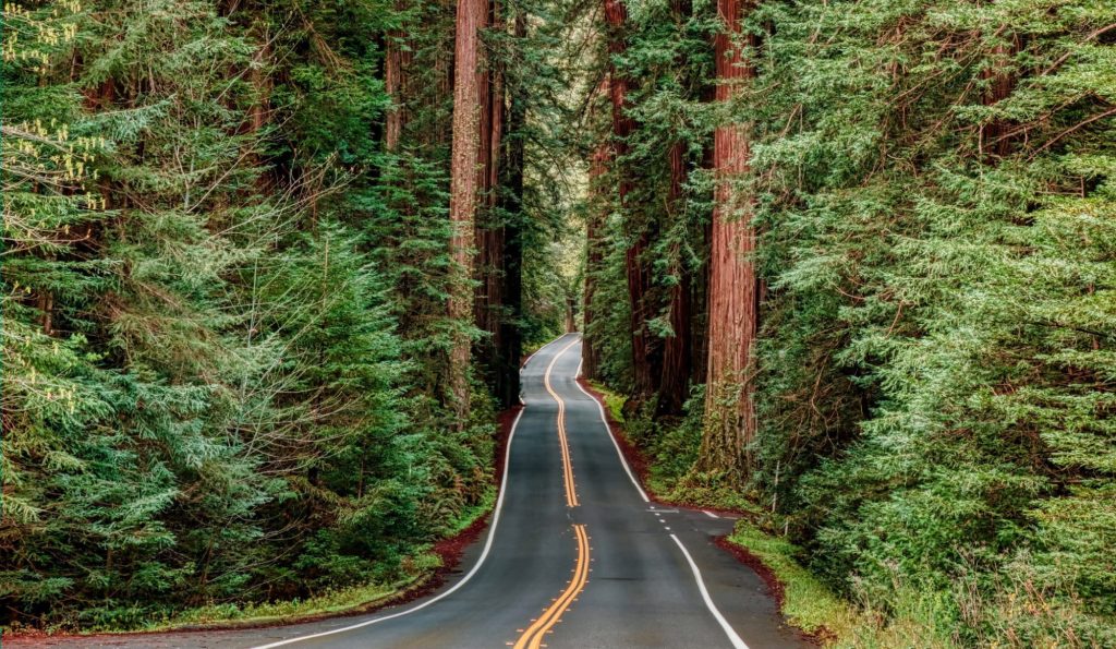
The print I chose to work with was the instruction method, using the slogan “Save Our Parks”. I wanted to have an image of the redwood forests with a road for this one, and layer the words on top of it. I found an image and ran it through Adobe Illustrator. Here’s my process from start to finish.
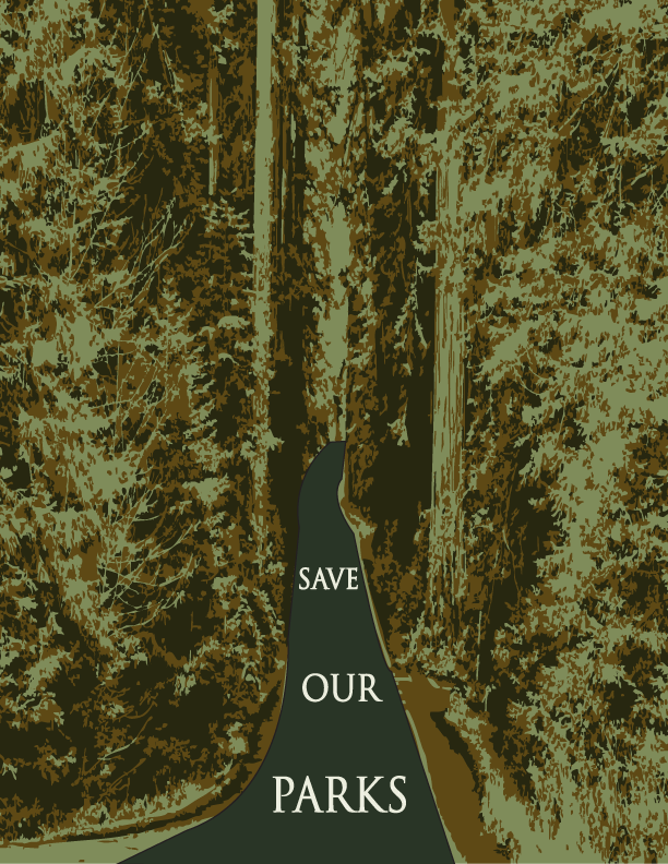
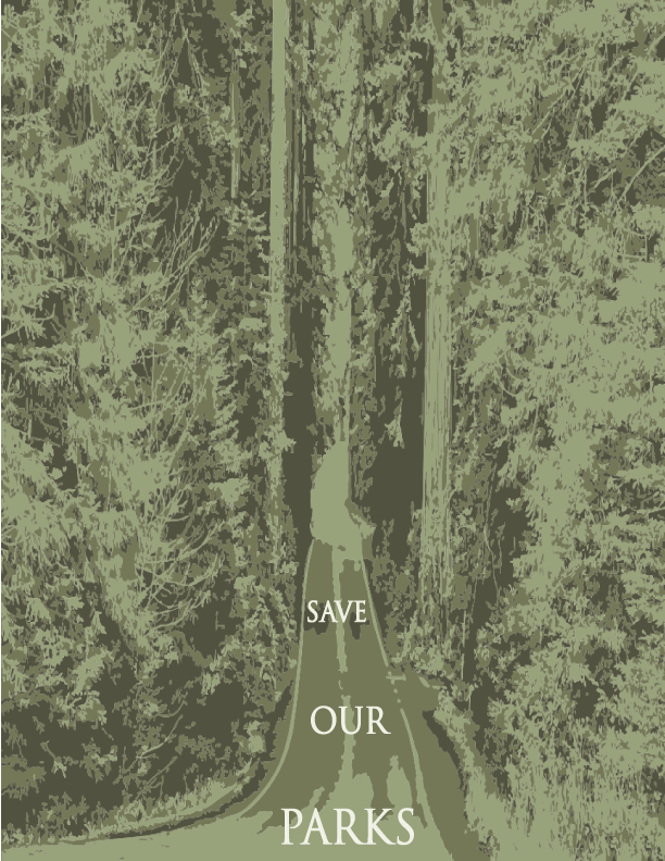
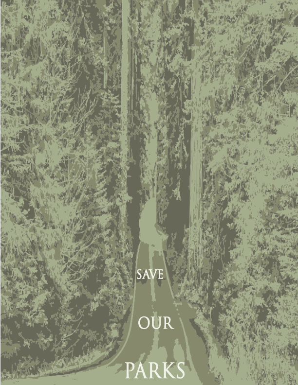
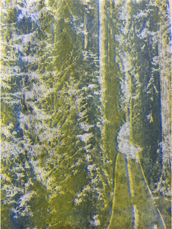
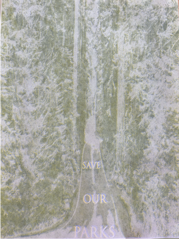
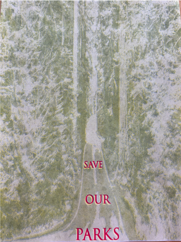
We didn’t have any green RISO ink, so I had to combine blue and yellow. It took a lot of fiddling to get the opacities right. I really like the way it turned out, I was a bit nervous about the way the master turned out (fifth picture). Working with the RISO was actually a lot of fun! Printing is a breeze once you get the hang of all the different buttons you have to press.
The feedback I received from classmates was a bit more negative than I was hoping for. They said that the details were mushy and that I should change the font and have a higher contrast. I guess I agree with these points, but it took a long time to get to the final print from the original. In the future, I would change the font and relate it more to the image itself. I still really enjoyed this project, and I’m glad that my classmates and I got so close over the semester.